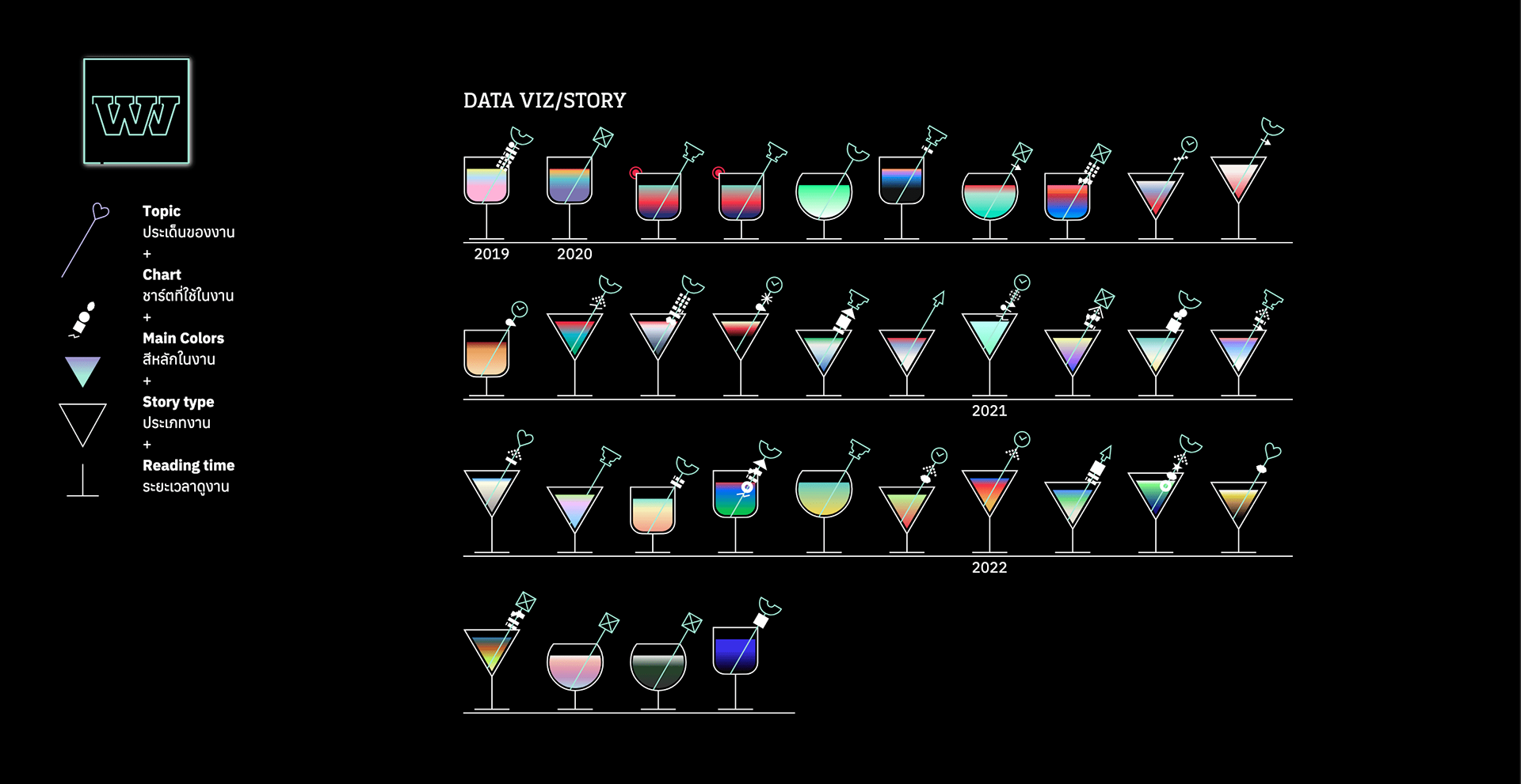
Last year, Punch Up and Wevis (formerly ELECT), celebrated our 3-year anniversary and took some time to reflect on our past projects. We created a visualization to showcase our accomplishments thus far and recommend standout projects for visitors to explore. As a data storytelling studio, we analyzed our projects to showcase the most frequently used chart types. This project review covers the past three years and serves as a thank you to our clients, who have been invaluable partners.
For this occasion, I designed a visual representation of a cocktail glass, inspired by the name "Punch," and infused it with the ambiance of a bar. Each element and color within the glass represents a different project. In addition to the design work, I ventured into developing this project by self-teaching myself Webflow for the first time. One of the challenges I faced was managing CMS data to display the glasses and implement horizontal scrolling. Another time-consuming aspect was coloring the gradients of the projects within the glasses. For some of them, I sought assistance from a friend on the design team to help me select the colors manually.
Overall, it was a fun project and a valuable learning experience for me to gain a deeper understanding of web structure. However, I did encounter some glitches that I couldn't resolve on my own. In the end, I enlisted the help of a developer to address one particular issue with the most used chart and successfully deployed the project. This experience has resulted in a shift in my perspective as a digital designer, and I am now more cautious when delivering my designs to developers.

