Foods in Bangkok are well-known for their taste, quality, and diversity. With over 100,000 data of restaurants from wongnai.com (a popular food rating platform in Thailand), the client, The Visual by Thai PBS, wants to show the insight from data along with side stories in culture and trends in Thailand that affect people's lifestyles in Bangkok.
Even if the food story is relatable for people, the first part of this project is designed as a customized quiz for audiences to select their choice of foods like when they enter the restaurant and invite them to follow our story. After they are selected, I bring them to the big table full of the choices they made. Then they can explore want they want to know by categories of food represented in a line chart of dish popularity and a density map of restaurants in Bangkok.
What I learned from this project is designing the paths of the story from the beginning selection choices to meet the ending together. For the visualization, I used Flourish to create a lines racing chart at first, but the developer created it on their own after that. Also designing the map is challenging on mobile view for a customized design like this. Additionally, finding photos of food that match people's recognition is more difficult than I thought. Some of the food in people's minds are different versions.
New opened types of restaurants are categorized by nationality of food. In the chart, the first line is Japanese food follow by Chinese and Korean.

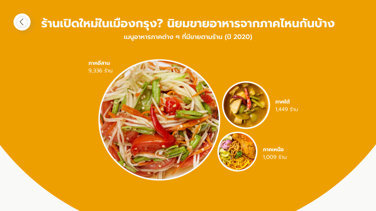
Bubble chart compare by types of local food in Thai

Bubble chart compare by types of dishes

Bubble chart compare by nationality of foods
Density map of food restaurants in Bangkok