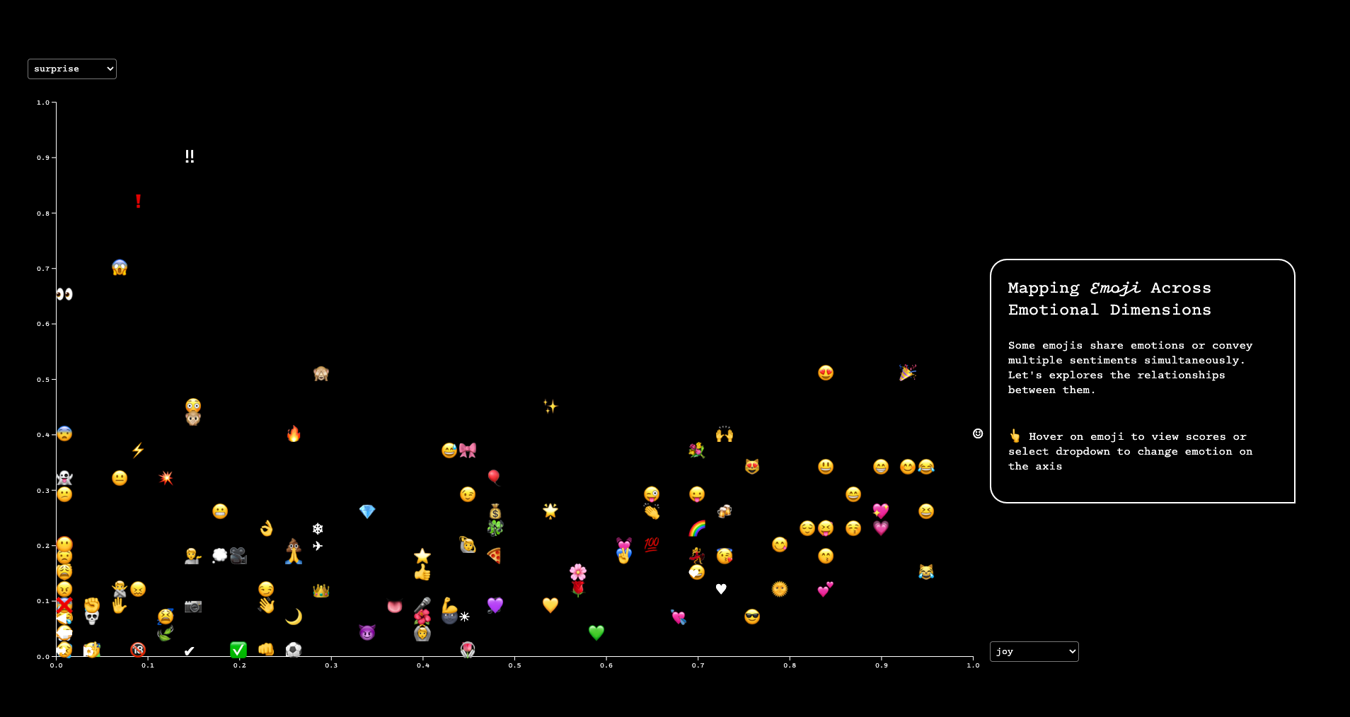
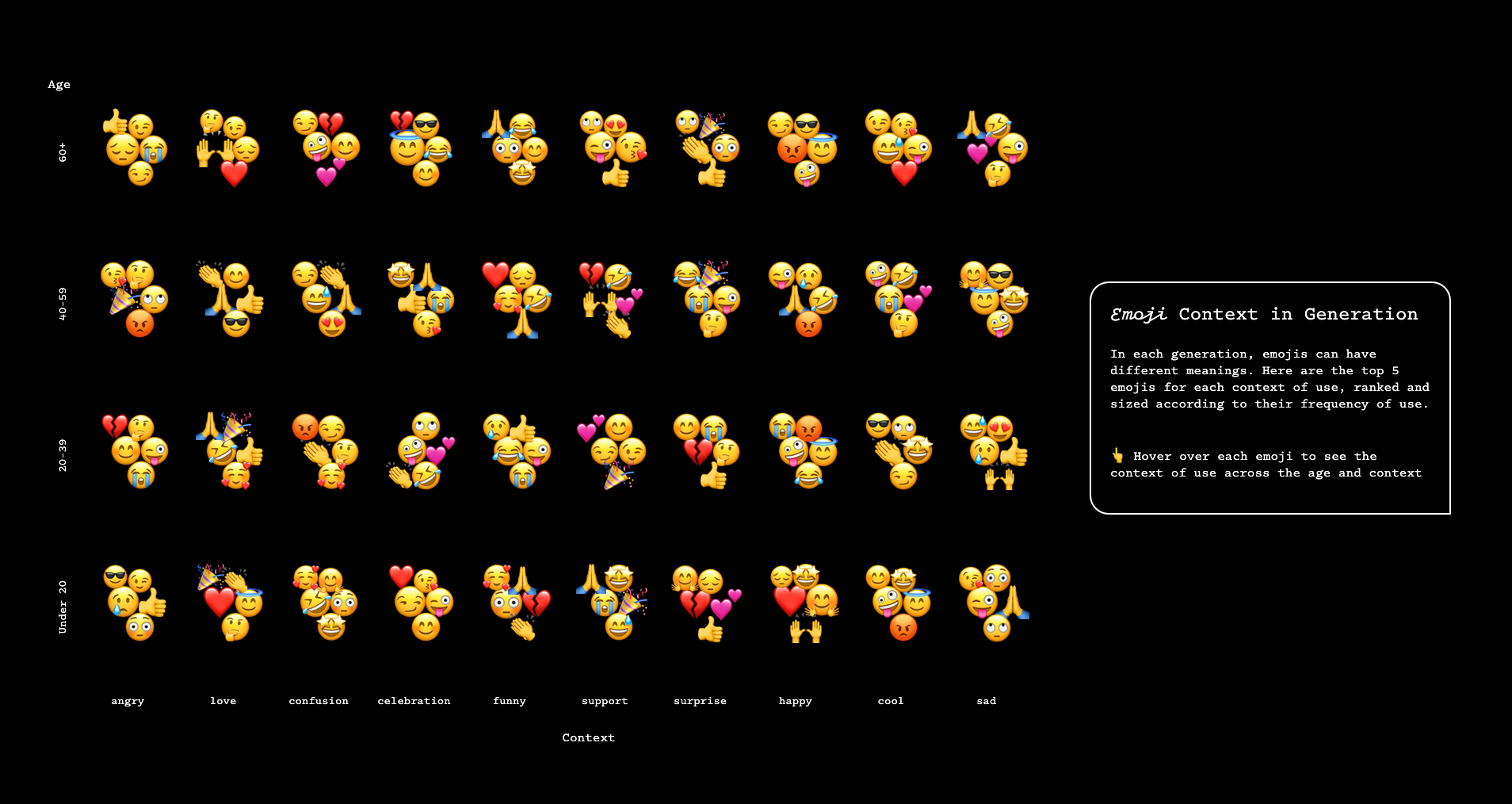
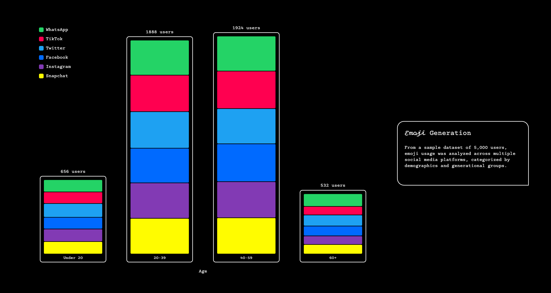
This project utilizes two datasets from Kaggle, cleaned and formatted in .csv, to create four different charts analyzing emoji usage. This was the final assignment for the Data Visualization and Information Aesthetics course. I chose this topic because I frequently use emojis in both work and text to express emotions, and I've noticed how easily misunderstandings can occur. I wanted to explore the meaning behind emoji usage from different angles, which led me to discover these intriguing datasets.
While the research sample size and data, which were collected via social media over a period of time, may not be fully representative, this project provided an opportunity to explore and experiment with various chart types using D3.js.
Note: The datasets and additional details can be found on the live site.


