This project was my first assignment in the Major Studio class, focusing on quantitative data analysis. The dataset, provided by the Smithsonian Institution, examines the representation of cats and dogs in the art and design museums within the Smithsonian network. To organize the information effectively, I categorized the data by object type.
For the final visualization, I used D3.js to create a grouped bubble chart represented by emojis, which differs from the initial prototype that used abstract shapes. The use of emojis makes the chart more engaging and accessible, offering a friendly and straightforward way for audiences to interpret the data.
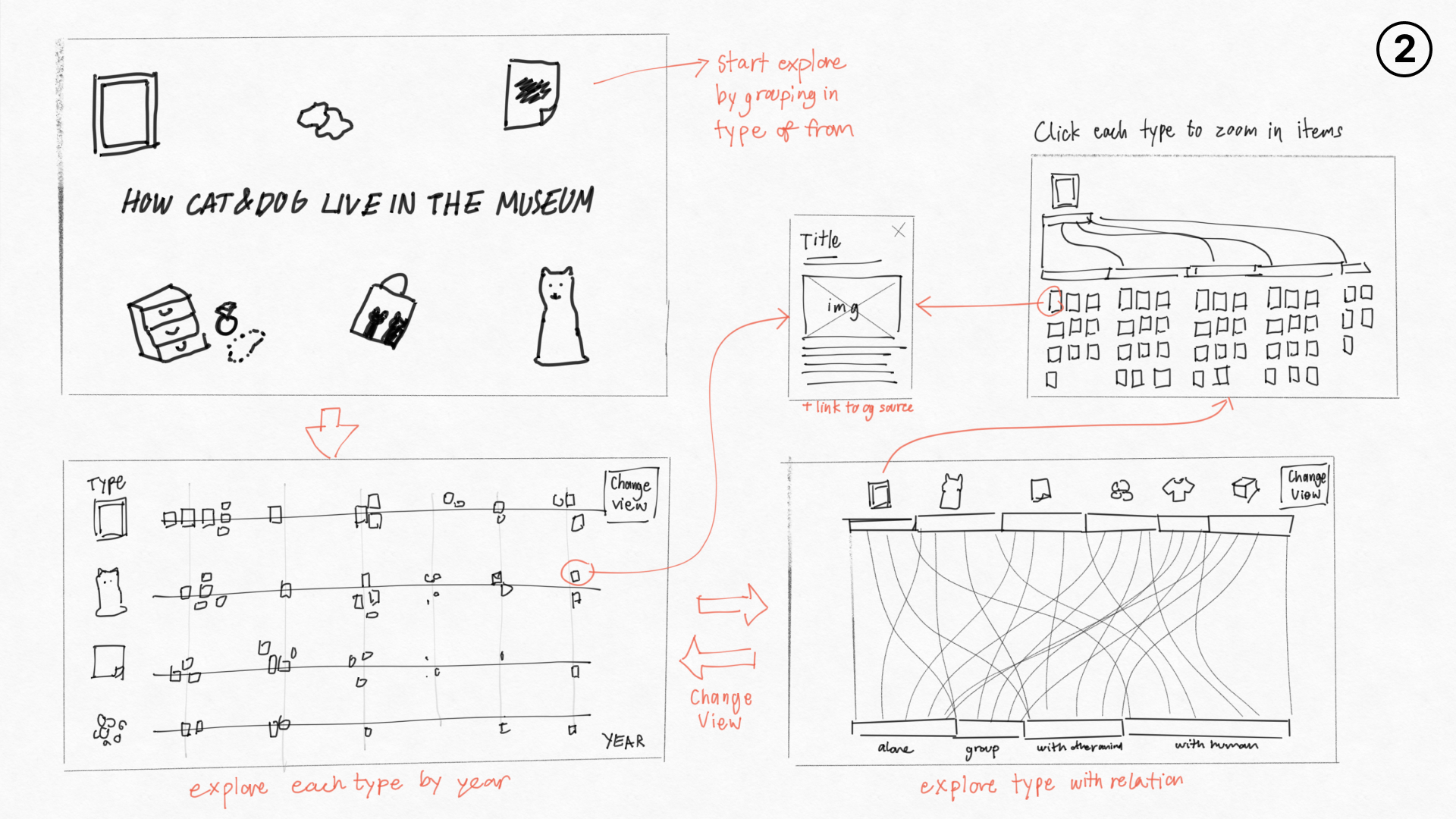
The initial sketches explored multiple visualization ideas, pushing the boundaries of what could be done with the dataset. However, due to the project’s timeline and scale, I refined and simplified the concept, prioritizing the most important insights for the final presentation. This process allowed me to balance creativity with practicality while effectively conveying the story behind the data.

Figma Prototype
